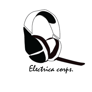
My company would be an electronics company based for gaming headsets and headphones. The age group and people I would be focusing on is mainly gamers and music junkies, the company's style would be laid-back, relaxed and fun, kinda like a "small cozy store one the corner" look. The main purpose would be for people to get quality headphones that can last for at least three years, they could be used for gaming, listening to music, or even recording music. The image connects with the "company's" style/products because what the company would sell audio-based products. The type of lines I used are thin and smooth giving it a crisp boarder that makes it seem more precise and relaxed then if i made the lines bold. The colour green represents stability and endurance. The colours might not contrast too much but the subtlety of the colour change gives it the look of being shaded which I like. There isn't any real "emphasis" in my logo to me, but what sticks out the most is probably either the writing, or the negative space inside the the middle of my headset. At the beginning I didn't really think of what shapes I used but I've realized I used quite a lot of circles and ovals (even if that isn't the whole only shapes I used). One of the biggest challenges with this logo was the pen tool, though the concept of it is simple I couldn't quite get it correct, and there was a lot of command Z afterward, but the most difficult part of the pen tool was making the curves. This project definitely helped me with my skills with the pen tool, and helped me get more patience with my work.


