Thursday, 8 December 2016
Tuesday, 29 November 2016
portrait photos:


This photo I took not only has rule of thirds but has a blurred background that helps empathize James (the guy in the photo/model/subject) and by exposing the photo in photoshop, and even though James has a busy background behind him the lines of the fence all lead to him (whose in the foreground of the photo).


This photo is a good representation of contrast because of Strahinja (the guy in the photo/model/subject) is wearing a dark jacket and hoodie that is has a decent amount of colour difference compared to the plain grey/white door behind him.
Wednesday, 9 November 2016
shutter speeds and aperture size

Slow shutter speeds if used with panning can create motion blur, panning is done by focusing on a single moving object/person while they are in motion, if done correctly it can produce a feeling of movement in the photo.

Fast Shutter Speed
Fast shutter speeds are good at catching in-the-moment photos, used for high speed movements, commonly used for freezing an action.

A wide aperture makes the foreground objects sharper and the background all blurry, its a good method of emphasis and is useful when a background is distracting or boring. (no one likes boring backgrounds imma right?)

Narrow Aperture
a narrow aperture keeps objects in the photo crisp and detailed, this makes it good for landscaping and technically any other type of photo.
Wednesday, 2 November 2016
type of aspects in photography
 |
| This photo shows the leading line, the leading line in this is the boardwalk, the board walk makes the viewer's eye move down the photo. The reason I choose this photo is because not only is it a good representation of leading line I also like the colour scheme, the pale colours give the photo an almost "vintage" look. |

| This shows framing in a photo, the frame is the window , the window makes your eye automatically look at the landscape outside. The reason I chose this photo is because I loved the vibrant colours and I find its a great representation of depth and space. |
 |
| This represents the rule of thirds, the rule of thirds in this photo is the fact that the bee is on/around the right vertical line. The reasons I chose this photo is that I really like the use of shutter speed to show the blur in the photo, the blur actually helps show the rule of thirds in this photo (this is my personal option). |
 |
| This photo describes interrupted pattern. I though that it was a good representation of pattern because it shows the basic idea of a interrupted pattern, a repeated and consistent design that remains that way until a object (or person intersects it and discontinues it. |
 |
| This photo is a type of "fill the frame", this means that a majority of the screen is filled with the image you want to emphasize. In this image the owl is filling the frame and making it so there is more positive space then negative space, the negative space in this case is the blurred background. |
Friday, 21 October 2016
logo
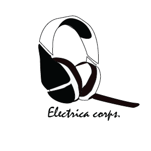
My company would be an electronics company based for gaming headsets and headphones. The age group and people I would be focusing on is mainly gamers and music junkies, the company's style would be laid-back, relaxed and fun, kinda like a "small cozy store one the corner" look. The main purpose would be for people to get quality headphones that can last for at least three years, they could be used for gaming, listening to music, or even recording music. The image connects with the "company's" style/products because what the company would sell audio-based products. The type of lines I used are thin and smooth giving it a crisp boarder that makes it seem more precise and relaxed then if i made the lines bold. The colour green represents stability and endurance. The colours might not contrast too much but the subtlety of the colour change gives it the look of being shaded which I like. There isn't any real "emphasis" in my logo to me, but what sticks out the most is probably either the writing, or the negative space inside the the middle of my headset. At the beginning I didn't really think of what shapes I used but I've realized I used quite a lot of circles and ovals (even if that isn't the whole only shapes I used). One of the biggest challenges with this logo was the pen tool, though the concept of it is simple I couldn't quite get it correct, and there was a lot of command Z afterward, but the most difficult part of the pen tool was making the curves. This project definitely helped me with my skills with the pen tool, and helped me get more patience with my work.


Thursday, 13 October 2016
rasters and vectors
The difference Between Vector Format and Raster Format
There are many differences between rasters and vectors, some more noticeable then others. For instance the sharpness and smoothness of the vector format, compared the pixelated style of raster format. Depending on what type of job/art you have you can use either.
Rasters are like pixel art, the pixels create a digital-looking image. The images' pixels can be large or small, but all of the pixels are the same size. The bigger the scale of the pixels the less detail there is in the photo or drawing, the smaller the scale of pixels the more detail there is in the . You can create a raster by zooming in on a photo. Rasters also have a large amount of colours that you can choose from, so when you design something with raster format no two colours have to be the same. Raster format is also compatible with many types of programmes.
Vector format is useful for logos, mainly because the fact that even when you re-size the image it will stay the generally the same. It is made more mathematically then a raster format. The smooth lines and crisp edges mean the designer of the image can add as much detail they want. Usually vector files have less data and are a lot easier to re-scale and it wont loose quality, that quality is useful if you want an image to have various sizes. This means big brand companies can use the same image/logo for bill-board projects, or just use the image on small products.
Thursday, 22 September 2016
Rhythm project

When I started drawing this on adobe illustrator I had an idea of what I wanted but nothing too specific. When I originally drew this I wanted the lines to gradually grow, but then realized that I wanted there to be more depth. So I decided to change it and delete some lines so it doesn't look to cluttered. The main rhythm I found in this piece is how the diagonal lines make your eyes travel from the top right corner to the bottom left corner.

At the beginning I was going to add more lines for this but I realized it looked pretty nice. When I kept adding I saw that it looked nicer like this and decided to keep it this way. To me it kinda looks like a silhouette of a cable bridge. though there isn't much rhythm in this artwork, all the lines end up making your eyes travel to where the two boldest lines meet.
NAC10 CyberArt review

"unknown"
Nathalie Bertin
Though the name of the art work is unknown to me, and so is the medium (how its made). I find the way the lines were smooth, lean, and curved helping the horse's appearance to look more natural. The shapes I mainly see are circles, triangles, and ovals. the textures that stand out to me is: the texture of the horse's hair, the and the slight roughness in the horse's coat, there's also a texture to the mask that leaves the illusion of the mask being coarse. The colours that the artists chose for the horse's body and the background make the horse's body almost pop, it obvious that the horse is a general focal point and no doubt the most important part of the artwork.
The more specific focal point for me is the horse's shoulder then after my eyes travel up to it's face. the asymmetrical balance is pretty well balance. the light is coming from off the left boarder. the darkest place is the underbelly of the horse. nothing that i can see in the artwork is repeated.
The art depicts a horse jumping with birds behind it, what the artist is trying to say, I'm not really sure, but the emotion I get from it is confidence, or the feeling of being free. I find that the artist wanted to have realistic aspects but the colours, background, and birds make it seem almost dream-like, to me. the way the art is done i feel like its expressing an emotion but its an emotion I'm not sure how to describe. Even with the free look and emotion, its clear that the artist took her time and was concerned with the lines, shapes and colours that she chose.
I feel like this drawing is mainly emotionalism, and imitationism, even though formalism is definitely there its way less visible. All in all I do like the art and I find its a really well done piece of artwork. I think my favourite part of the whole drawing is the unity of it, nothing really seems out of place.
the end.
Subscribe to:
Posts (Atom)